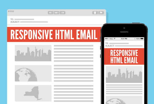
Just seven short years ago “responsive” design entered our lexicon via web designer Ethan Marcotte. He observed that the web functions as a supreme disrupter making transience and inconsistency a normal state of affairs. We’ve had to adjust for a plethora of screen sizes, tech advances, operating systems, and user preferences. As a result, responsiveness has become mandatory; we are permanently at the edge of another digital footprint and mobile is leading the way.
By 2018, 80% of email users will access their email accounts via a mobile device (The Radicati Group “Email Statistics Report, 2014-2018”).
As mobile devices have proliferated, content has adapted to accommodate smaller screens and our somewhat abbreviated attention spans. Mobile commerce makes up 30% of all U.S. ecommerce according to recent Hubspot stats and “more Google searches take place on mobile devices than on computers in 10 countries including the U.S. and Japan.”
What does it all mean? People are searching their mobile devices for the most relevant information they can find. It doesn’t matter who delivers the message; if it’s the right message, it’s a win. This demands marketers become adept at delivering relevant content to a specific audience at the right time. Responsive design is a part of that conversation. Once you know who your audience is and what they want, you can refine the message for responsive email. Here are 6 tips for the process:
1. Use Simplicity. Be concise and economical with content and design. Use fonts like Helvetica, Arial, Trebuchet MS, or Verdana. These fonts render correctly across multiple platforms and guarantee most people will see the page correctly. Your email should also mimic the design aesthetic of your website and include your logo – that’s a surefire way to build brand. Make sure your logo or header clicks back to your website or landing page.
2. Be Specific. Get to the point. People using an iPhone 5SE, for instance, have a very small window. Distill your content into a precise message and let subscribers visit your website for more in depth information.
3. Have a Call to Action [CTA]. Make the CTA visible and near the top of the newsletter. This increases the changes that subscribers will visit your landing page. To avoid misclicks, leave enough white space around the CTA and make the CTA button at least 44 pixels wide.
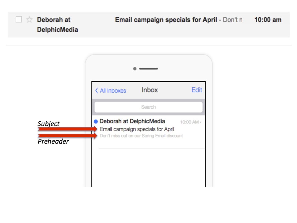
4. Don’t forget to optimize your preheader text. The preheader is the short summary text directly following the subject line when an email is viewed. It is automatically pulled from the first 75-100 characters of your email copy and displayed underneath the sender name and subject line in a subscriber’s inbox. In desktop email clients this would be called the “preview pane”. If you don’t add preheader text, make sure the first thing a reader sees is a compelling message. The one thing you don’t want subscribers to see is, “Having trouble viewing this email?” To avoid the automatic display of administrative content, make the first lines of copy concise. It can mean the difference between someone engaging with your brand and deleting your email.
5. Use columns sparingly. To ensure your email displays across mobile devices, opt for two columns maximum. Using more will stack and squish on mobile displays.
6. Use correct HTML and templates. Your email service provider will have a complement of responsive email templates that you’ll be able to modify.
LITMUS provides a free download of responsive email templates available below.
[The download is a zip file]


